Sushi Experience Redefined
Enhancing customer journeys through ethnographic insights and designing a space to move beyond language communication.
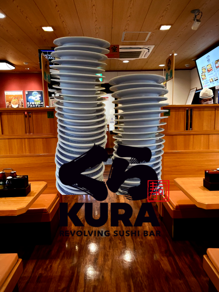




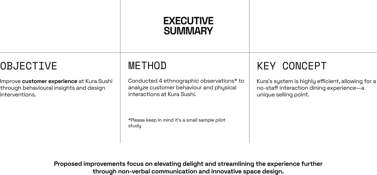
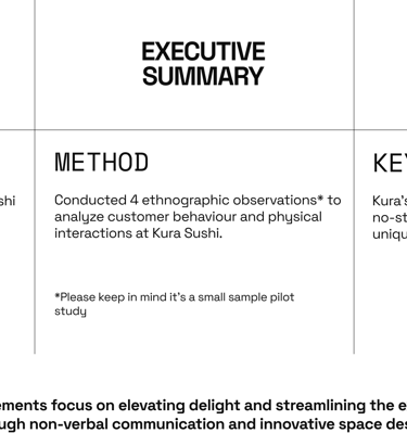
Objective: Improve customer experience at Kura Sushi through behavioural insights and design interventions.
Method: Conducted 4 ethnographic observations * to analyze customer behaviour and physical interactions at Kura Sushi.*Please keep in mind it’s a small sample pilot study
Key Concept: Kura’s system is highly efficient, allowing for a no-staff interaction dining experience—a unique selling point.
Proposed improvements focus on elevating delight and streamlining the experience further through non-verbal communication and innovative space design.
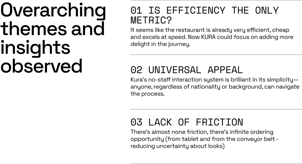
Overarching themes and insights observedive space design.
01 IS Efficiency the only metric?
It seems like the restaurant is already very efficient, cheap and excels at speed. Now KURA could focus on adding more delight in the journey.
02 UNIVERSAL APPEAL
Kura’s no-staff interaction system is brilliant in its simplicity—anyone, regardless of nationality or background, can navigate the process.
03 LAck of Friction
There’s almost none friction, there’s infinite ordering opportunity (from tablet and from the conveyor belt - reducing uncertainty about looks)
Kura Sushi’s customer experience is already rooted in efficiency, with minimal staff interaction and streamlined processes.
However, there is a significant opportunity to elevate this experience by focusing on additional metrics beyond efficiency—metrics that highlight Kura’s core values of fun, comfort, safety, and taste.
By incorporating these values more intentionally, Kura can strengthen its brand identity and create a more memorable, enjoyable experience for customers of all backgrounds.


The goaL:Remove any notions that dilute the process universality.
Design the spaces in which there’s no verbal language, where there’s no words.








CUSTOMER JOURNEY BREAKDOWN: SCENE 3: CHECKOUT AND EXIT
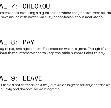
GOAL 7: CHECKOUT
Customers check out using a digital screen where they finalize their bill. However, some have issues with button visibility or confusion about next steps.
GOAL 8: PAY
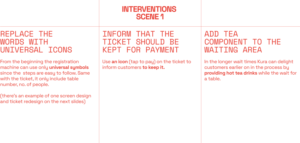
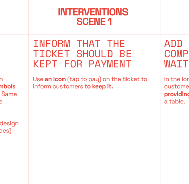
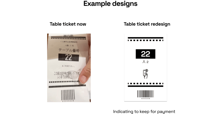
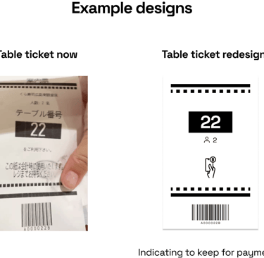
So easy to pay and again no staff interaction which is great. Though it’s not explained that customers need to keep the table number ticket to pay.
GOAL 9: LEAVE THE RESTAURANT
Overall there’s not frictions on a way out which is great for anyone that wants to leave quickly and doesn’t like wasting time.
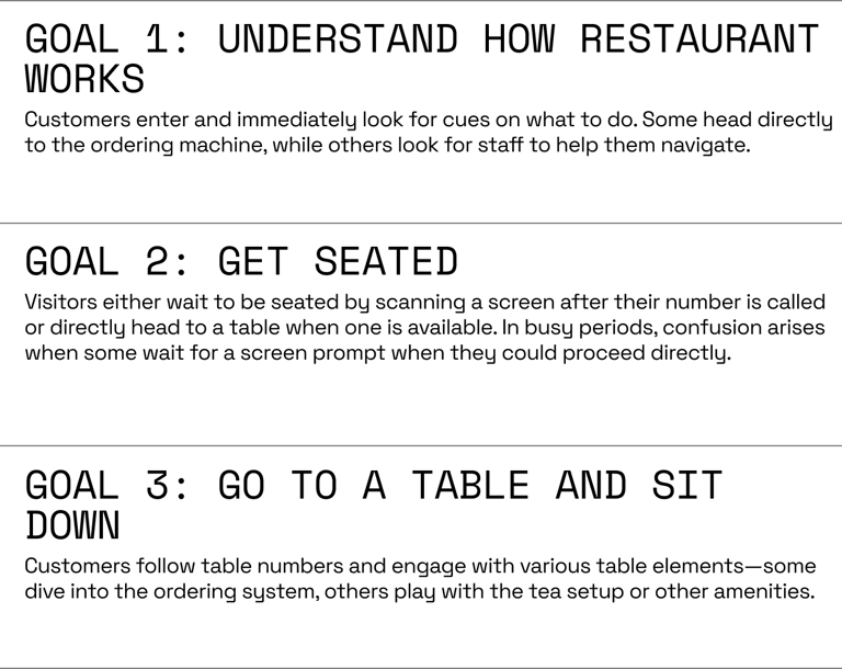
CUSTOMER JOURNEY BREAKDOWN: SCENE 1: ENTRY AND SEATING
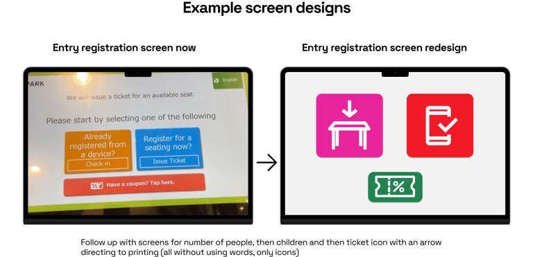
GOAL 1: UNDERSTAND HOW RESTAURANT WORKS
Customers enter and immediately look for cues on what to do. Some haad directly to the ordering machine, while others look for staff to help them navigate around.
GOAL 2: GET SEATED
Visitors either wait to be seated by scanning a screen after their number is called or directly head to a table when one is available. In busy periods, confusion arises when some wait for a screen prompt when they could proceed directly.
GOAL 3: Go to a table and sit down
Customers follow table numbers and engage with various table elements—some dive into the ordering system, others play with the tea setup or other amenities.
CUSTOMER JOURNEY BREAKDOWN: SCENE 2: ORDERING FOOD
GOAL 4: NAVIGATE THE MENU
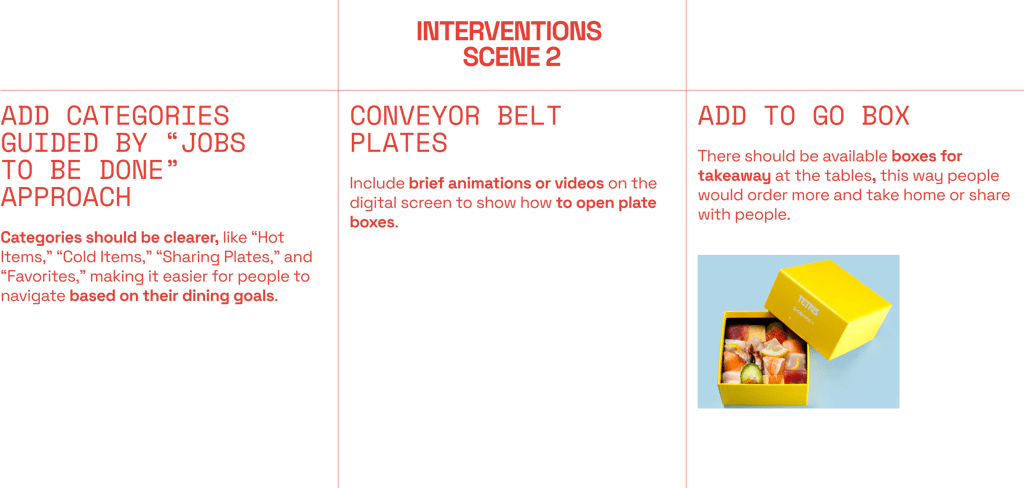
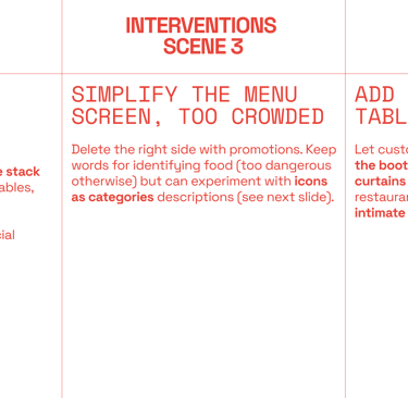
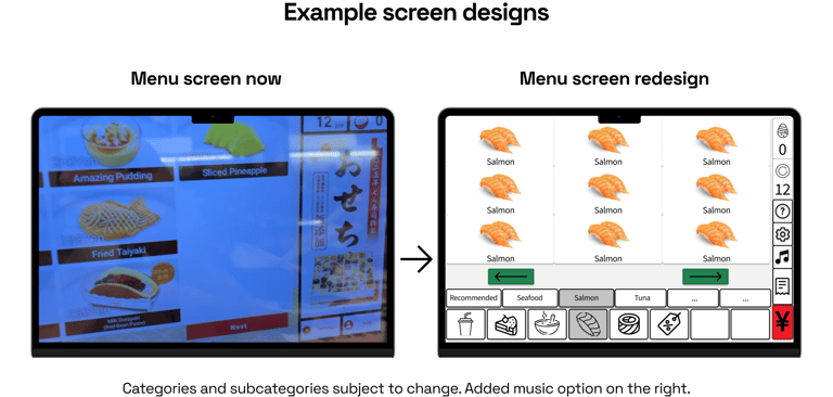
Customers often spend time figuring out menu categories. Some are overwhelmed by options, while others appreciate the simplicity of picking from the conveyor belt and reducing choice overload.
GOAL 5: ORDER FOOD
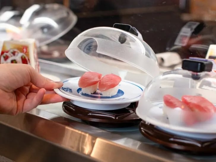
Here because of the instantaneous ordering, customers do not ask for dessert menu but can browse it whenever and can order how many they want without feeling judged. Some people have been observed to have troubles with opening the plate boxes on the conveyor belt.
GOAL 6: DECIDE TO STOP EATING
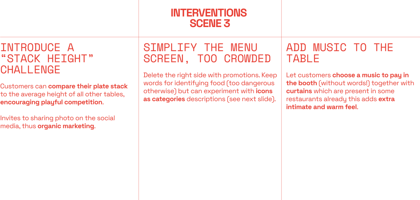
The easiness of constant ordering requires an active decision to stop. Putting plates in - can be done throughout eating. This is a way to play Bikkurapan which is not properly explained.
Here’s the big picture 📈: Efficiency matters, but what if we started tracking things that make a restaurant experience amazing beyond speed? For Kura, this means looking at metrics like enjoyment, comfort, and taste satisfaction—all the things that make dining feel special, not just fast.
To see real change, we could measure how much more comfortable people feel navigating without language barriers, or how much more fun they have with gamified elements that make them want to stay (and keep ordering). Benchmarks on comfort, enjoyment, and even brand perception could show us how these tweaks stack up in the real world.
This video offers a step-by-step walkthrough of the customer experience at Kura Sushi. It highlights each stage of the customer journey, from entry and seating to ordering, dining, and checkout, analyzing where the experience excels and where there is room for improvement.


